

Which, thanks to the digital wizardry of scanners and the Picasa photo editing program became this...

and this....

and...urm...this as well....
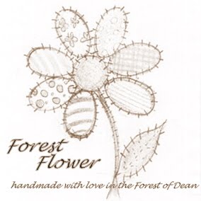
I love them all - the colours look great on the top one, the simplicity of the black and white version is gorgeous and I love the vintage feel of the sepia coloured one....
So now I have a dilemma - which one should I use as my new logo?
I would very much appreciate some help with this decision so please, lovely people, don't be afraid to leave a comment and let me know what you think...
Hi,
ReplyDeleteI love the flower and I think the colours looks gorgeous! I would say the colour suits the style of items you make. I would also imagine that if you go with the colour option, then you'll still find a place for the black and white and/or the sepia with different aspects of your branding.
Hope that helps xx
Hello love, Agree with Melissa that a bit of colour helps and suits the nature of your product. Not sure about the multi-coloured one though as there is a lot going on for your eye to sort out - and your greens are clashing (on the logo itself and the leaf). I like the simplicity of the B&W one as well, maybe try one colour - say purple or something? Anyhoo, just suggestions... Kate x
ReplyDeleteA vote for colour from me too!
ReplyDeleteEveryone seems to like the colour - maybe try that with a black logo...?
ReplyDeleteI like the black one, think maybe like Kate said, try it out in just one colour? x
ReplyDeleteI like the coloured one best, though they all look good. :-)
ReplyDeletei like the coloured one it looks fab, are u going to vector it? so u can use it anywhere at any size?
ReplyDeleteThey are all lovely, but I think I would have to go with the coloured one and you could use the other in many other ways as I think Melissa has already suggested. Sound like a broken record, sorry!
ReplyDeleteNatalie x
OK - It depends on what you're going to use it for. In multi-color reproduction printing, every additional color is an additional cost. Set-up costs are additional as well. There are ways of keeping costs down - a site you might look at is: www.vistaprint.com (USA) they have some useful online tools to play around with.
ReplyDelete(No,this is NOT a commerical for them, I have just used them before-that's all.)
A single, bold color against a neutral background also makes a quite a statement. Ordering your printing in large quantities also lowers the cost per piece.
Since a lot of what you sell seems to be softgoods, a single tie-on folded handtag(with room in a corner for hole punching and plenty of additional room for anything else you might want to say to your clients) might be just the ticket. This same tag, unpunched and the correct size, can be used as your business cards! Cute!
Also, cut in half and add glue on back - a label! (yes, it will be a thick label cause it will probably be cardstock) Just some ideas!
Anyway, my fav is the multi-colored one. Just realize that it may be difficult to match all those colors exactly - but you can play around with it. Happy crafting!!
I like the coloured one best, though they all look good. :-)
ReplyDeleteEveryone seems to like the colour - maybe try that with a black logo...?
ReplyDeletei like the coloured one it looks fab, are u going to vector it? so u can use it anywhere at any size?
ReplyDeleteA vote for colour from me too!
ReplyDeleteI like them all. The colourful version is my favourite though.
ReplyDelete